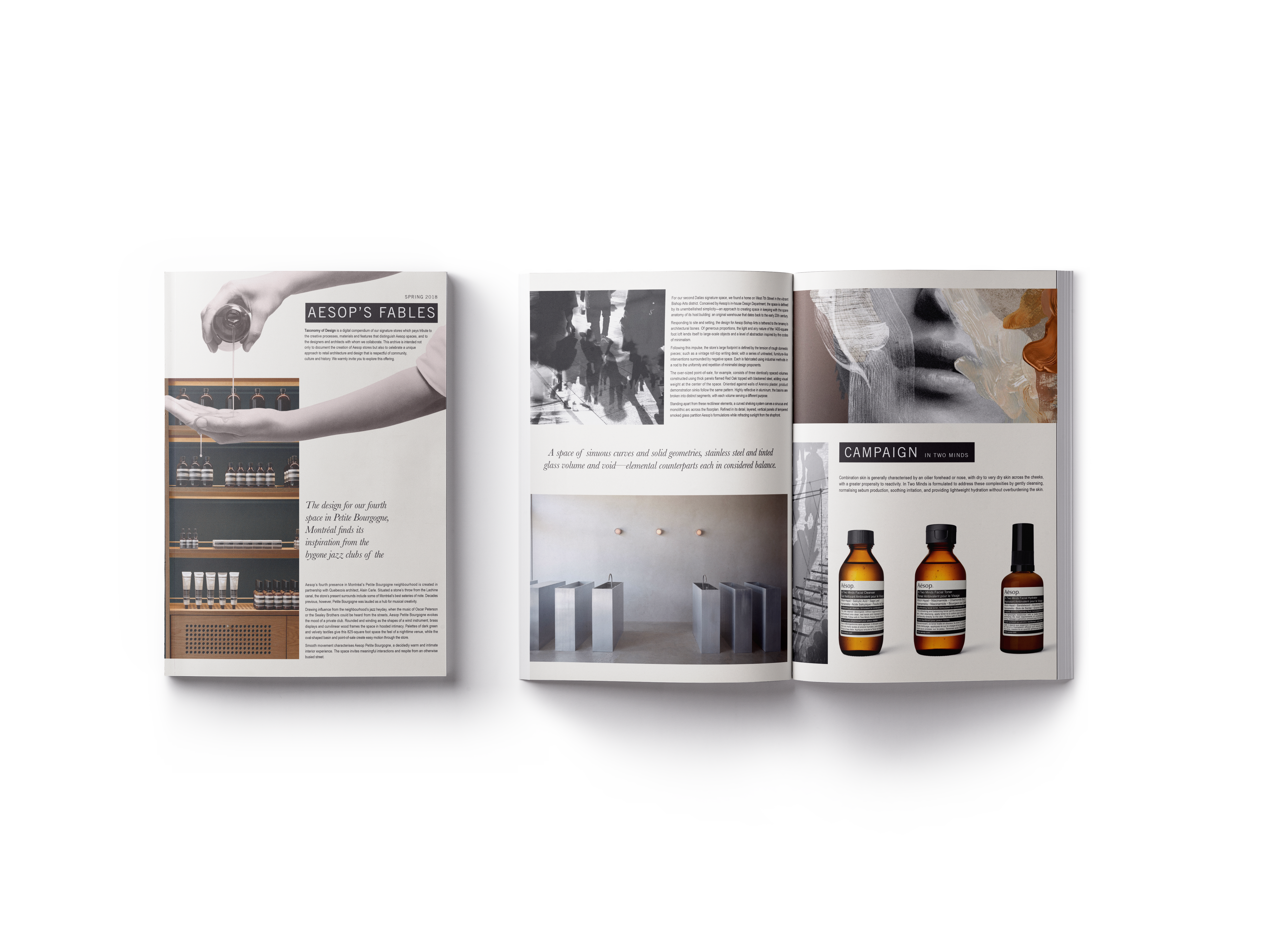
We created ZIGU in order to share our passion for fine cuisine with the people of Hawaii. We have been
fortunate to acquire the perfect building for our restaurant. The restaurant was once a wooden low-rise
Apartment building which was constructed in 1939. The building has a unique character which we have
been very careful to preserve. This has allowed us to create a cozy atmosphere that wouldn’t have been
possible in a more modern building.
The key to the perfect dining experience is fresh local ingredients, prepared by chefs dedicated to the art of cooking. Here at ZIGU, you will enjoy dishes such as juicy Japanese omelettes made with fresh local eggs, sushi made from freshly caught fish, and Kahuku Shrimps from Kona. We also have Ichiko and Shochu varieties that perfectly complement these dishes."


For this project, we were tasked to rebrand a restaurant of our choice. I have chosen Zigu as they have quite a unique space for their restaurant which I wanted to highlight in their business system. For the logo design, I drew inspiration from their story about how they incorporate fresh local ingredients into their cuisine. I have chosen the hexagonal shape as it represents longevity and good fortune in Japanese culture. Inside this shape I have chosen a fish motif to represent their Japanese cuisine along with leaf motif to represent the freshness of their local ingredients. The inspiration for this logo is from Japanese hanko stamps. The font I have chosen has a look to it similar to a stamp to represent that. This look has also been incorporated into the logo itself.